IOS Screentime Redesign
2021
I explored how Screen Time’s existing design could be made better by improving the strength of its app controls. The goal was to redesign the interface to support users to manage their smartphone use and avoid distraction. The result was a clickable mid fidelity prototype showcasing an interface with deeper controls for helping users manage their apps easily.
Desk Research
Prototyping
Wire-framing
User Interviews
Interface design
Usability testing
Figma
Problem
Screen Time for iOS helps you track and control your device usage. You can set app time limits and schedule downtime to curb phone addiction. However, it’s not that functional for individuals; it’s more useful for parents as they can put app limits behind a password. Without this, individual users easily bypass limits. I believed I could enhance Screen Time by making app limits stronger to help users manage their phone use and avoid endless scrolling.
Process
In order to redesign Screen Time I followed the UX framework of the double diamond. Starting with the problem, I moved through a series of divergent and convergent stages to come to a specific solution.
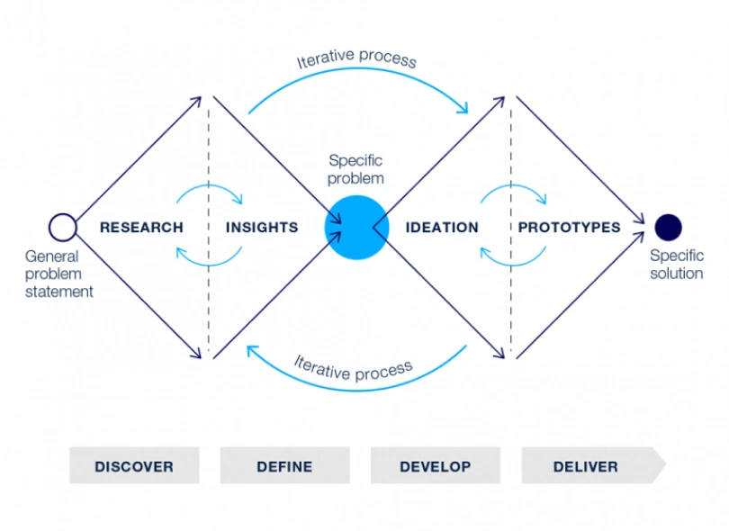
Research
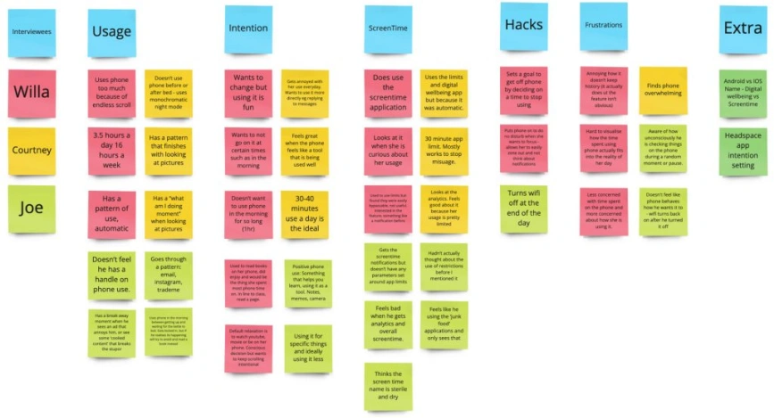
I began using desk research, benchmarking, and persona mapping to dig deeper into the problem. This revealed a significant insight: Screen Time and similar apps primarily tackle limiting current behaviours, not fostering new habits. This got me thinking: could Screen Time be enhanced by actively guiding people toward healthier habits? Armed with this idea, I conducted user interviews to understand daily phone usage patterns, ideal phone use, and familiarity with Screen Time and other digital well-being tools.
The user research revealed three core insights:
- Users are happy when they control their phone use but frustrated when it controls them
- They have specific patterns of phone misuse at certain times,
- Screen Time limits are weak and rarely used, confirming my initial suspicion.
Low Fidelity Prototype
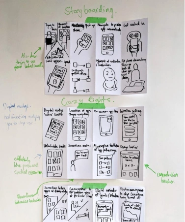
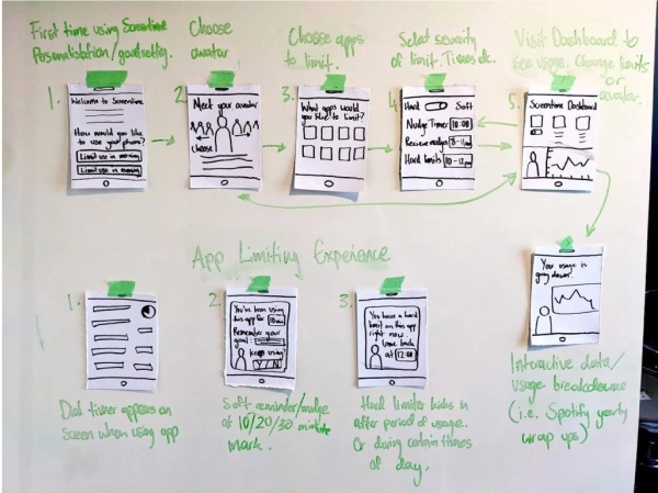
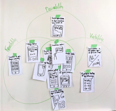
With research complete, it was time to begin structured ideation. I began with storyboarding and crazy eights to spark ideas. Afterward, I used a DFV matrix to rank them, and interestingly, the top ideas naturally connected into a user flow. This evolved into the 1st and 2nd paper wireframes, which eventually transformed into the low-fi digital prototype.
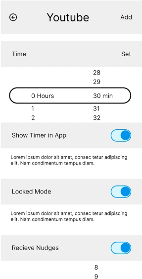
In this prototype stage, I focused on personalisation features for users, including goal-setting and an on screen avatar to help guide users. I also added more app limits with a locked mode and enhanced the in-app limiting experience with an on-screen timer.
User Testing
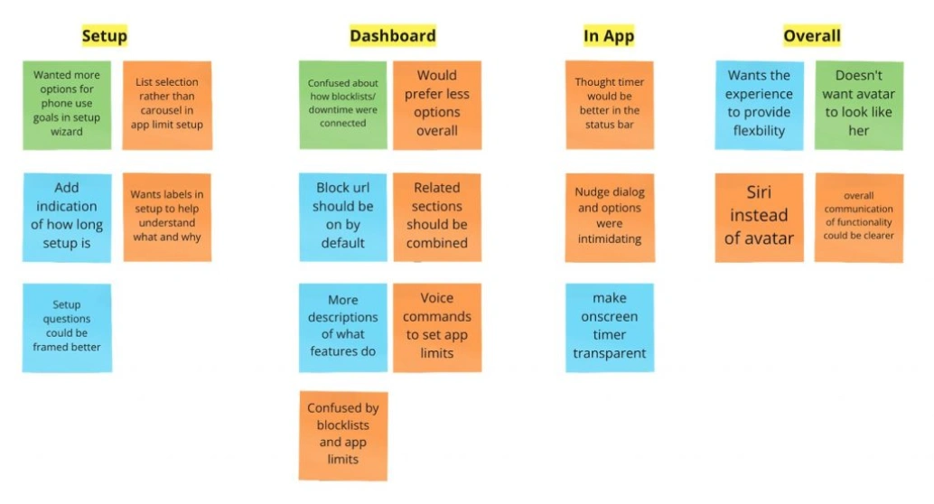
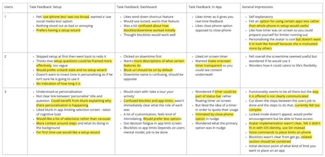
With a clickable prototype ready, I conducted user testing with three participants to gauge their thoughts on the new features and design. From their feedback, I uncovered some key insights:
- The design was too complex, causing decision fatigue. Simplifying features and using clear labels became a necessity.
- Users desired flexibility in app control, with some preferring gentle nudges while others needed stricter limitations.
- I also observed the need to better connect related functions and clarify the integration of personalisation features like goal setting and the digital avatar.
These insights then helped to inform the mid fidelity prototype:

Mid Fidelity Prototype
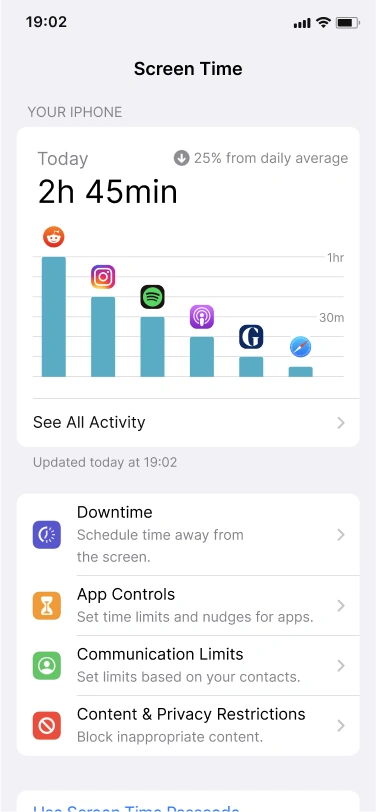
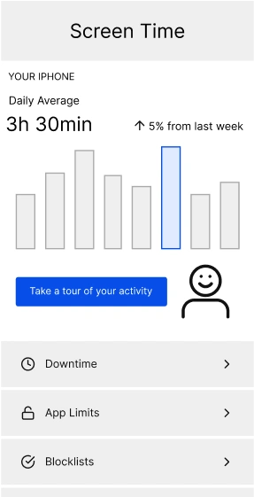
Screentime now has a simplified interface that gives users stronger controls to manage their apps:
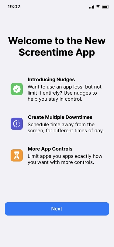
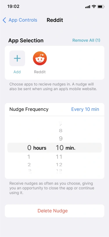
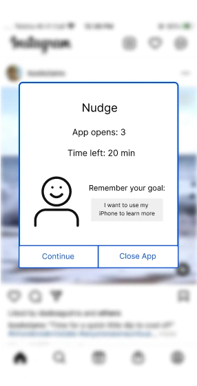
- The highlight is the new nudges feature, allowing users to receive full-screen reminders while using an app to break concentration and encourage better phone habits.
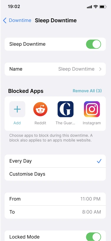
- Downtime now lets you create multiple schedules for different parts of the day, offering flexibility to block apps during sleep, work, or focus periods, with a new blocklisting feature and an optional locked mode for added security.
- App Controls now do more with app limits and nudges. App limits set daily caps and come with an onscreen timer for gentle reminders. This also features a locked mode like in downtime.
- A newly visualised usage tracker, showing today’s total screen time and your top app.
Next Steps
The next phase of the project would be focusing on refining the mid-fidelity in-app limiting experience, particularly by testing the nudges feature. I also want to revisit promising ideas, like personalising Screen Time setup and implementing goal-setting for phone use habits, through dedicated UX research. Additionally, I’d explore integrating Screen Time with existing iOS health and well-being features for a more comprehensive digital well-being app. Who know if this is something we’ll see from Apple eventually?
